Thriftd Resale Design
Context
I frequently use Depop to buy and sell pre-loved clothing online. While the items are great, their resale listing experience is incredibly overwhelming.
I wanted to create a resale flow for listing items that reduced user overwhelm and provide a clear and simple way to list items for sale. I created a design for a reselling app “Thriftd” that shows possible improvements for mobile resale.
The Problem
Within current resale apps, there’s an immense amount of information a user needs to fill out to list their item. While that provides accuracy for platforms and greater detail for interested buyers, the processes these platforms use are arduous and can lead to increased drop off rates due to the extensive amount of required information.
Tools
Figma
My Role
Product, UX/UI
Visualizing the problem
When viewing the reselling experience on Depop, the amount of information needed to create a listing is immensely overwhelming.
Without clear instructions for the user on how many pictures to take, what type of photos are acceptable, and no guides on how to price items in competition with the market, users can easily feel lost navigating the experience that’s at the heart of the Depop platform.
On this page alone, there’s 13 clicks total for a user to upload 4 photos and fill out key product information for their item.

How might we give more context to the user?
While Depop grouped sets of information within sections on the page, their design lacked a sense of progress and context that reflected each step in the process.
For example. taking the right photos takes more time than filling out sizing information. This extra time spent on a single task on one page would make subsequent tasks in view feel larger than they could really be.
Why don’t we separate these tasks based on difficulty to give users a sense of progressive accomplishment?
This would also give each page more room to include key information while maintaining essential whitespace.

How does this look in process?
I created a simple and accessible layouts that broke down each step using a progress bar at the top to keep users motivated.
Building trust through walkthroughs
The context pages help users who are new to the reselling experience understand what to expect from the process.

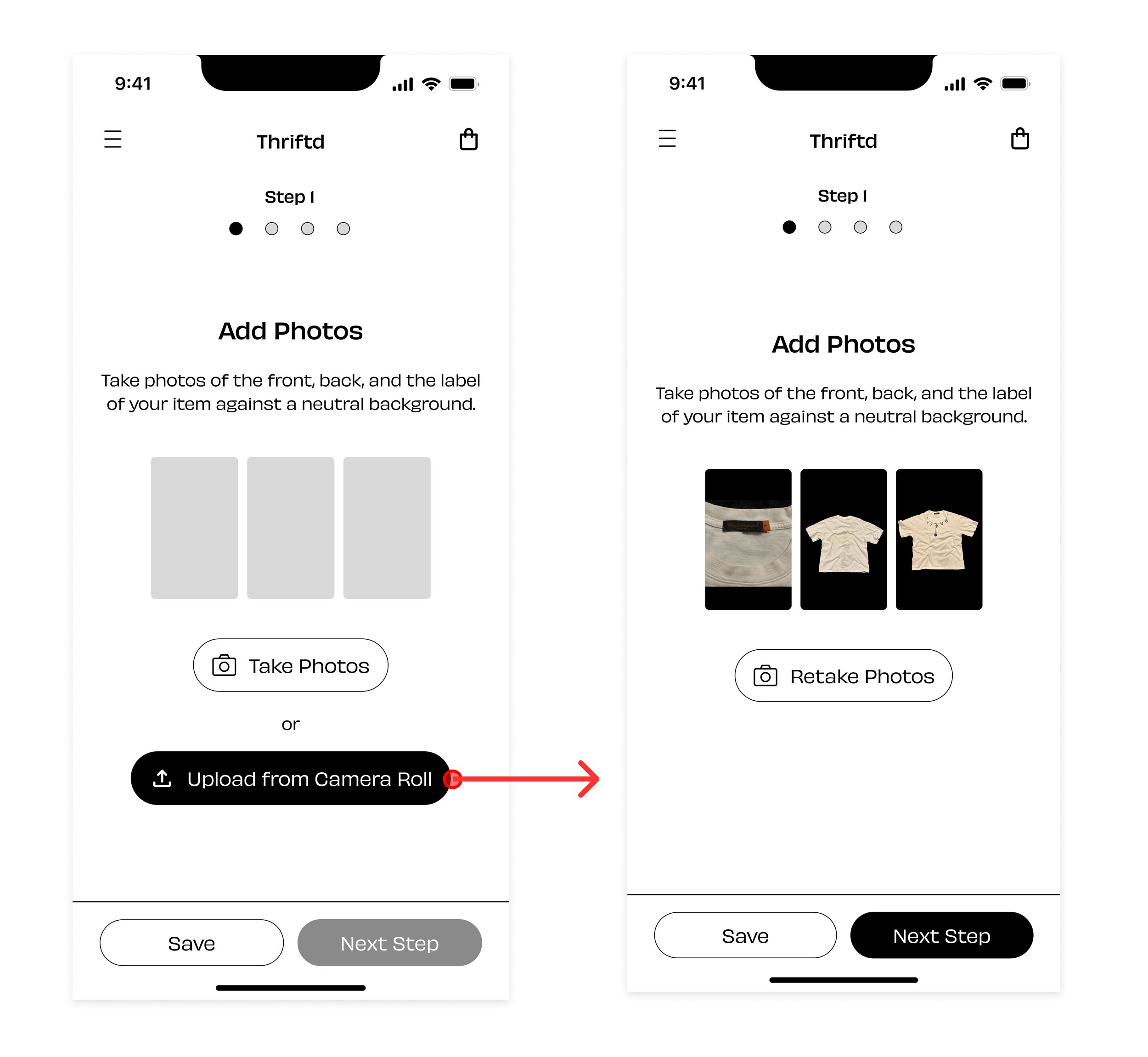
Adding Photos
The larger image preview sizes, as well as detailed instructions helps guide a first time user through the flow and understand their progress through the progress bar at the top.
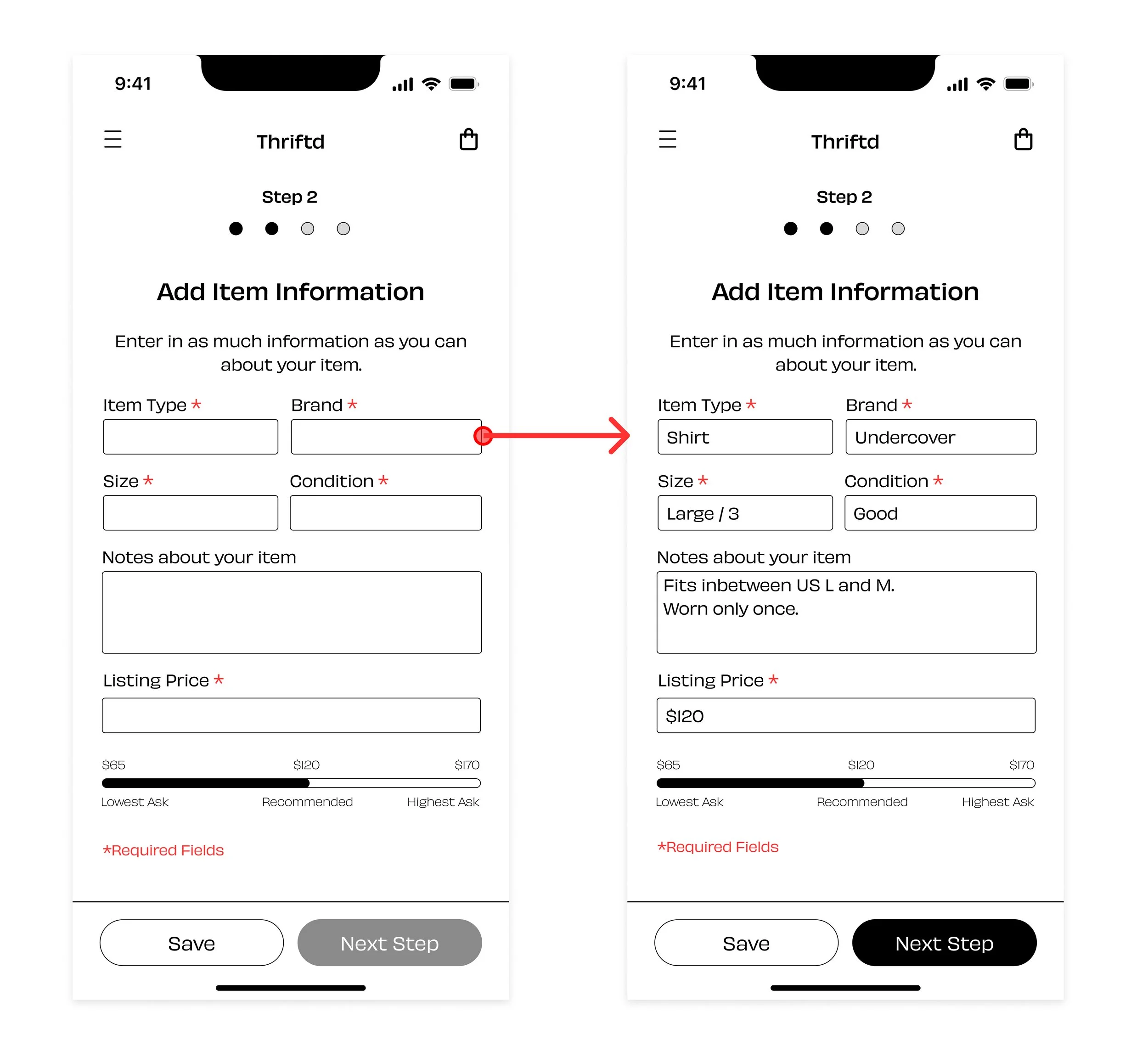
Entering Information and Pricing
The simplified view asks for key information and provides pricing guides for users based on market values of similar items.
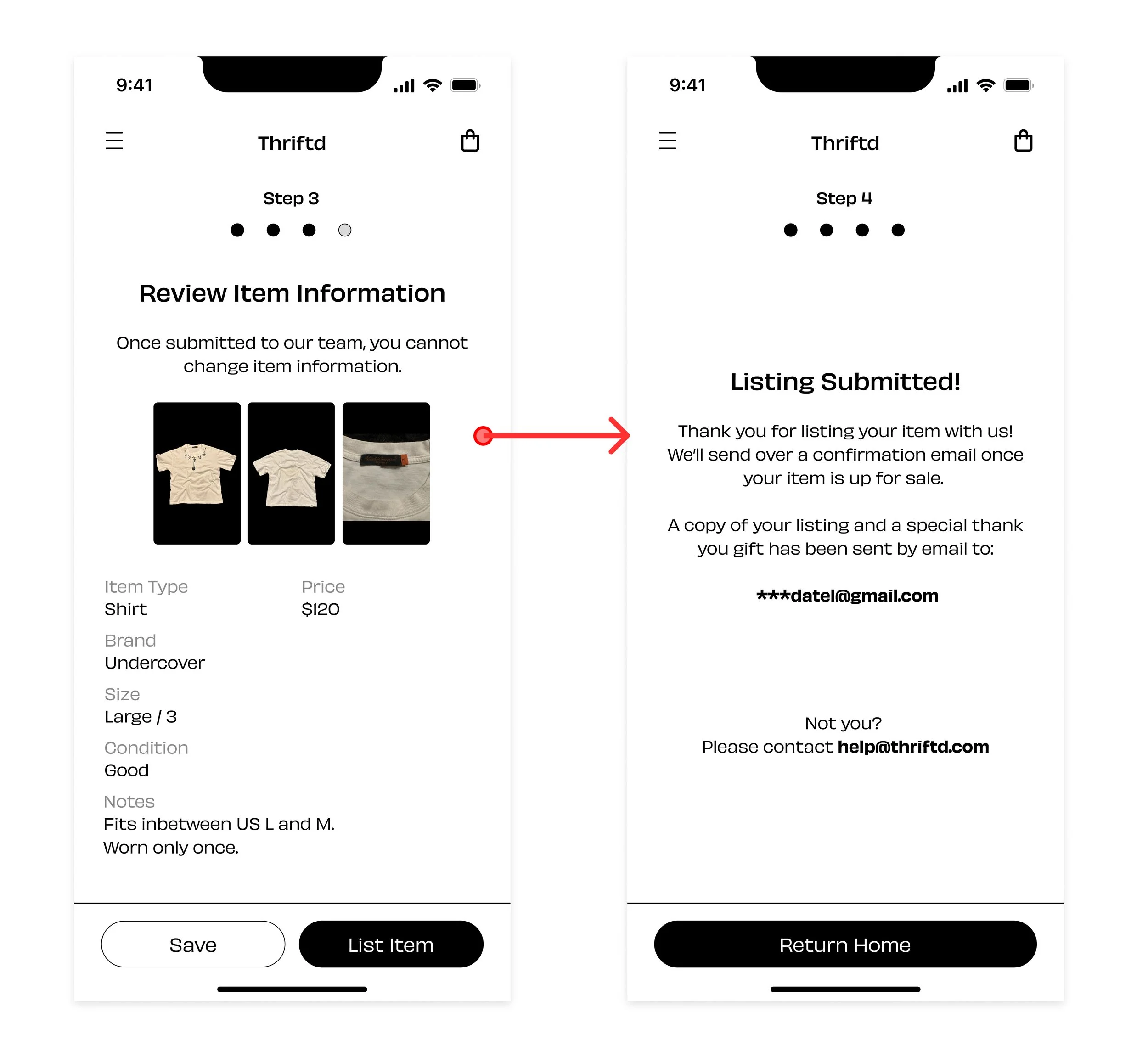
Reviewing information and listing confirmation
After entering information, users can review their information and list their item for sale. I thought this would be a great point in a user journey for a brand to offer a reward for user engagement.