EventVox Community Experience
Context
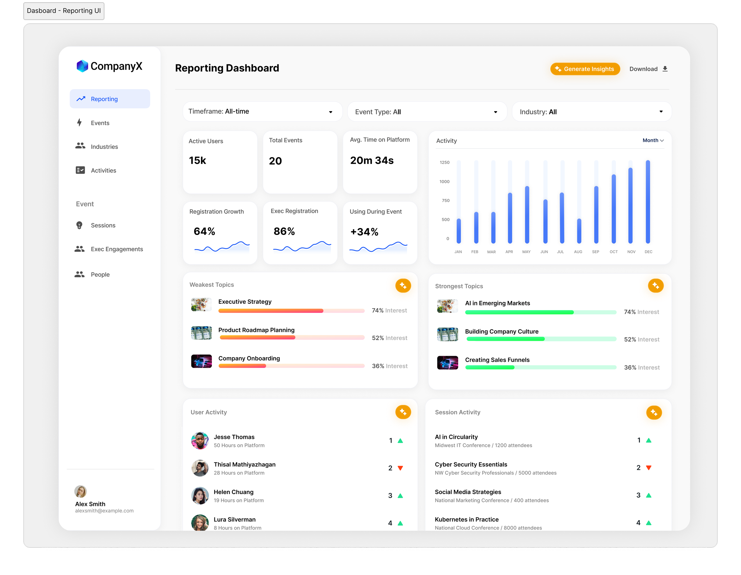
EventVox is a SaaS platform that enhances corporate events by turning in-person interactions into data-rich experiences. Attendees connect through the web app while hosting companies gain valuable insights via the companion dashboard.
The Problem
The MVP was hard to use and harder to scale — organizers couldn’t navigate key workflows, and the UI lacked structure, consistency, and brand clarity. I redesigned the platform from the ground up to improve usability, build trust, and support funding efforts.
Tools
Figma (Autolayout, Tokens), Notion,
Miro
My Role
Sole Product Designer
Led UX, UI, design system, and visual design for MVP → V1 transformation
SUMMARY
An overview of the redesign changes and their impact on user and business goals.
SOLUTION 1
Design System
Since EventVox’s new UI needed to be built for scale and whitelabeling, I created a design system for their product that would help set them up as their product grew and could be easily changed based on company branding.
Business Need Addressed: Scalability and Whitelabling Services
User Need Addressed: Consistency and Pattern Recognition
SOLUTION 2
A Refined Way to Manage Multiple Events
Since posts in the existing design were grouped into separate events and sessions, creating tags for posts helped organize posts for the aggregate style feed. Users could then self-select for what they were looking for from one place.
Business Need Addressed: Managing Multiple Events
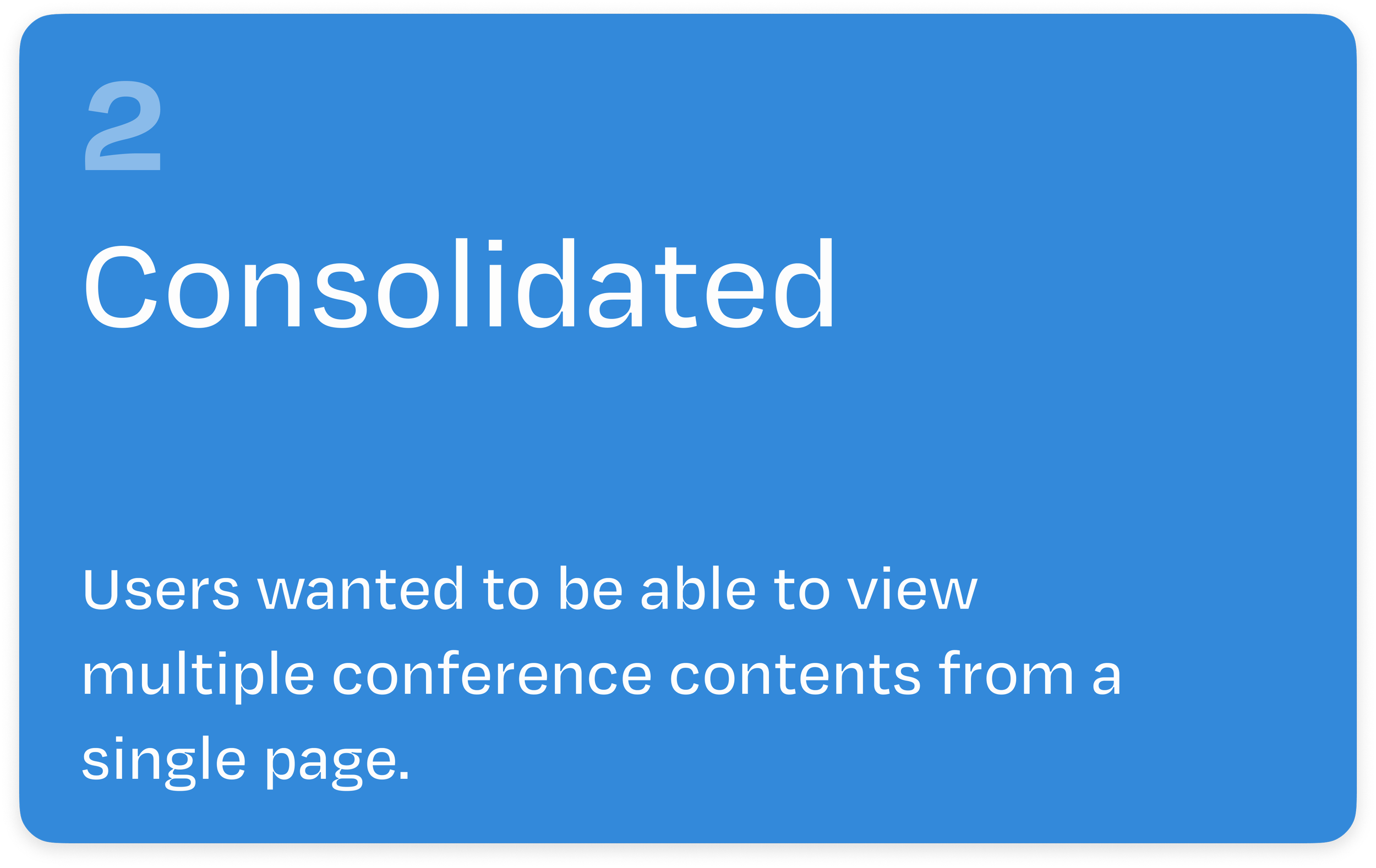
User Need Addressed: Intuitive and Consolidated way to Explore
SOLUTION 3
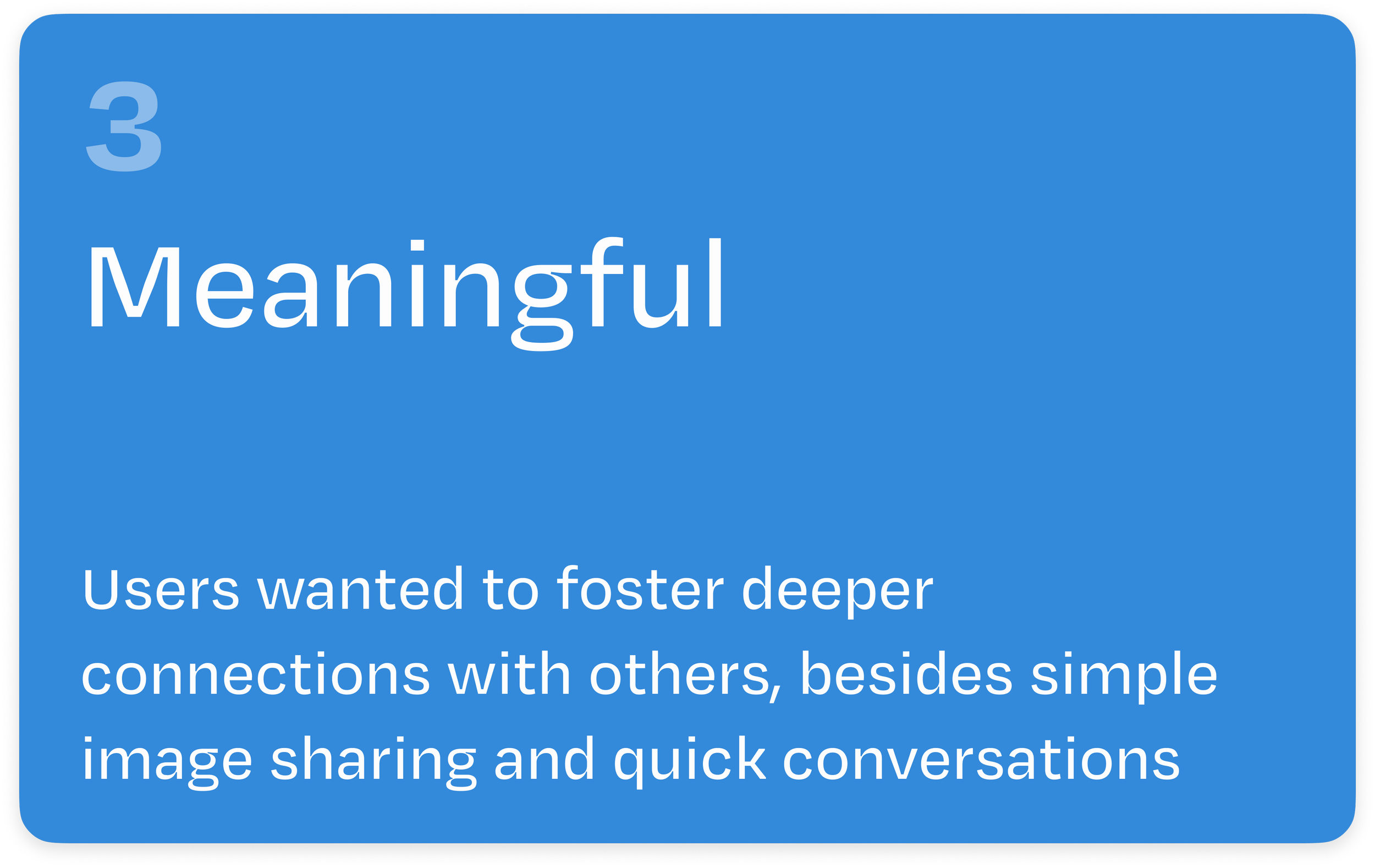
Creating new ways for attendees to connect and businesses to gain insights into user interests
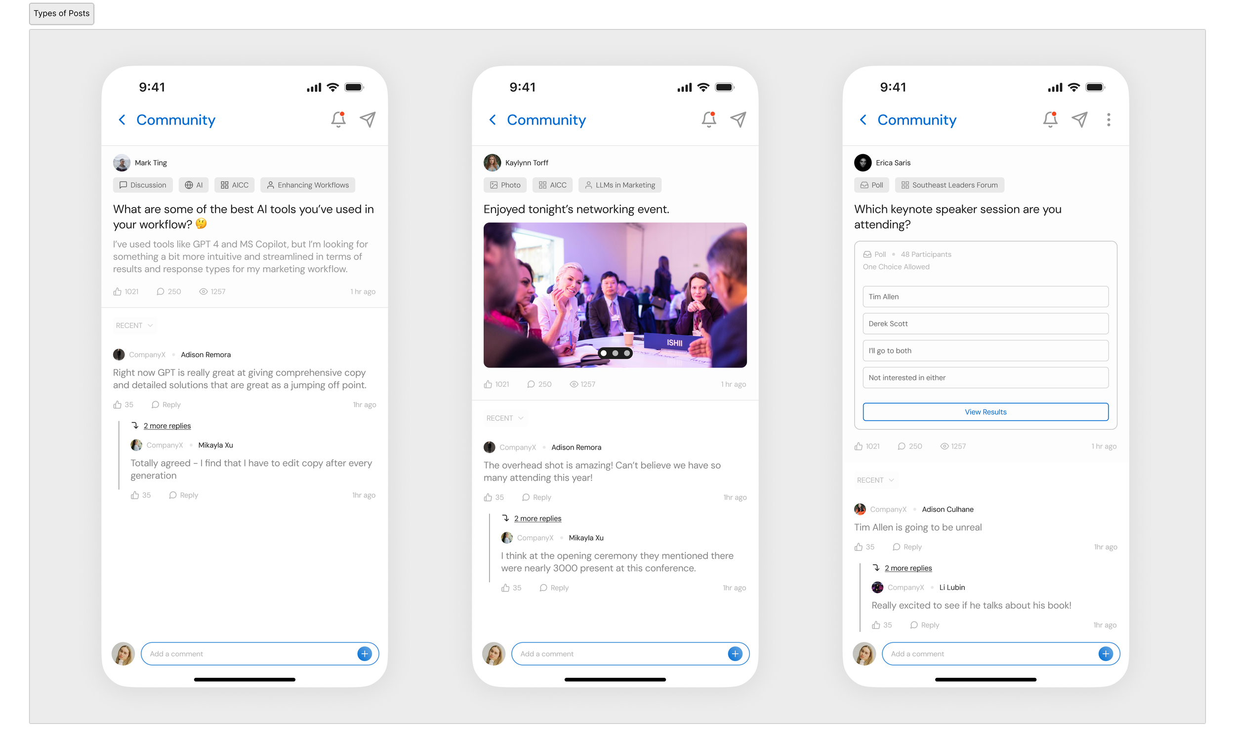
In addition to a new look for text posts, attendees could now create deeper connections with each other and with session leaders during events through polls and image galleries.
Business Need Addressed: Features that compliment In-person events
User Need Addressed: Meaningful ways to connect with other attendees
Before and After
The Design Process
Phase 1: Foundational Exploration
In this section, I’ll explore the existing user experience and showcase the findings from a competitive analysis and an audit of their existing sitemap. I’ll also lay out the main user and business needs the team wanted to achieve during this redesign.
Phase 2: Design Ideation
Here, I’ll build upon the findings discovered in Phase 1, and create the foundations for the new user experience based on both user and business needs.
Phase 3: Designing in Figma
Based on the foundational work in Phase 2, I’ll create a new user experience from wireframe to high-fidelity prototype, including iterative changes made along the way.
Phase 4: Pitch Deck in Figma Slides
In this section, I’ll display the pitch deck created for investor presentations (*financials redacted).
Phase One
Foundational Exploration

UNDERSTANDING THE EXISTING PRODUCT
What was the main goal of the EventVox Community Webapp?
The EventVox Community Webapp was developed to address gaps in existing event apps. The founders, experienced in Corporate Events Management, recognized that attendee engagement was a crucial KPI for hosting companies to measure event success and secure additional funding.
By enhancing in-person interactions and fostering online connections among attendees, the app provides ways to improve engagement metrics while providing hosting companies with data-backed insights into attendee behavior and motivations.
PRODUCT ARCHITECTURE AND DESIGN
How did their existing product function?
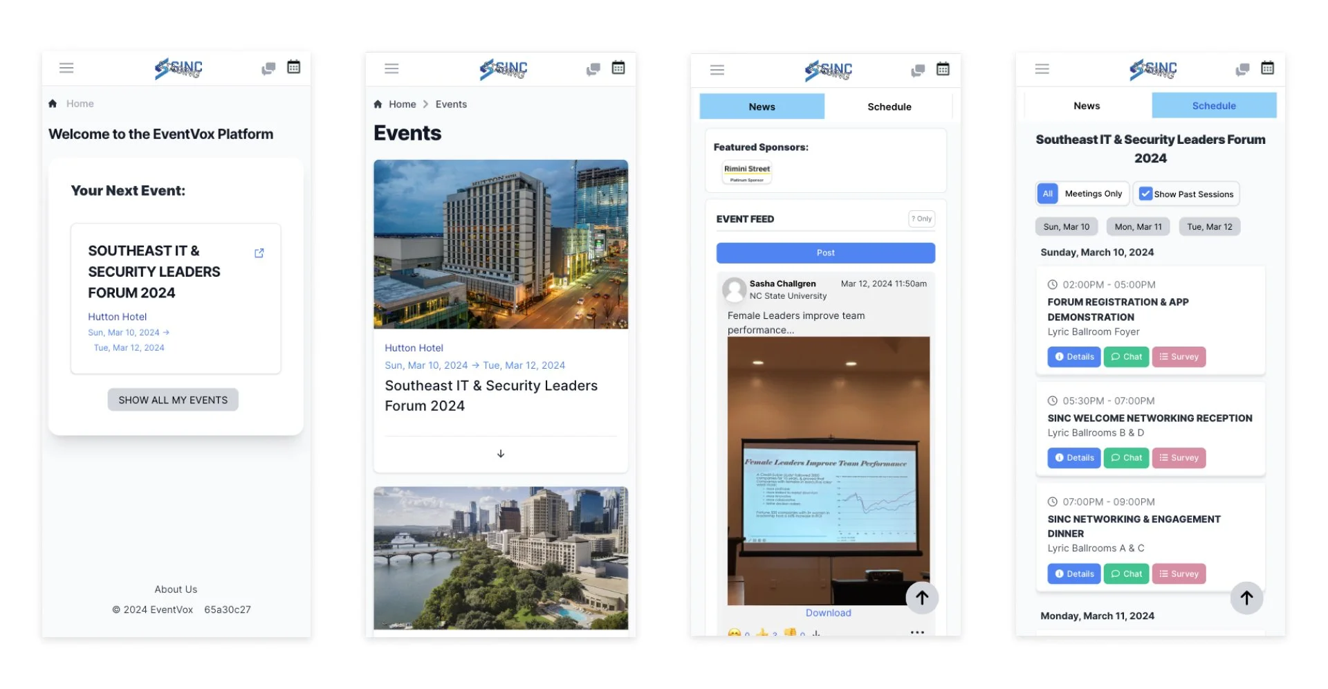
Their existing webapp kept events separated and divided each event into two main sections:
Event News. which operated similar to a social media feed, but limited interactions to simple photosharing and commenting.
Event Schedule, which listed out the Event Sessions with features to view session details, comment on a specific session, and complete a survey for the session.
Existing Sitemap
Their existing sitemap created siloed experiences among each event. Switching from one chat or session to the next was tedious and more often than not, users would only engage with 1 or 2 sessions during each sign in.

Existing UI Design
In addition to the tedious page switching, the existing web app design was dated, with heavy shadows, an inconsistent use of typography and icons due to a lack of a design system, users were understandably frustrated while navigating the web app.
OUTLINING USER AND BUSINESS NEEDS
What were the main user and business needs for the redesign?
User Needs

Business Goals


COMPETITIVE ANALYSIS
Understanding where we could fit
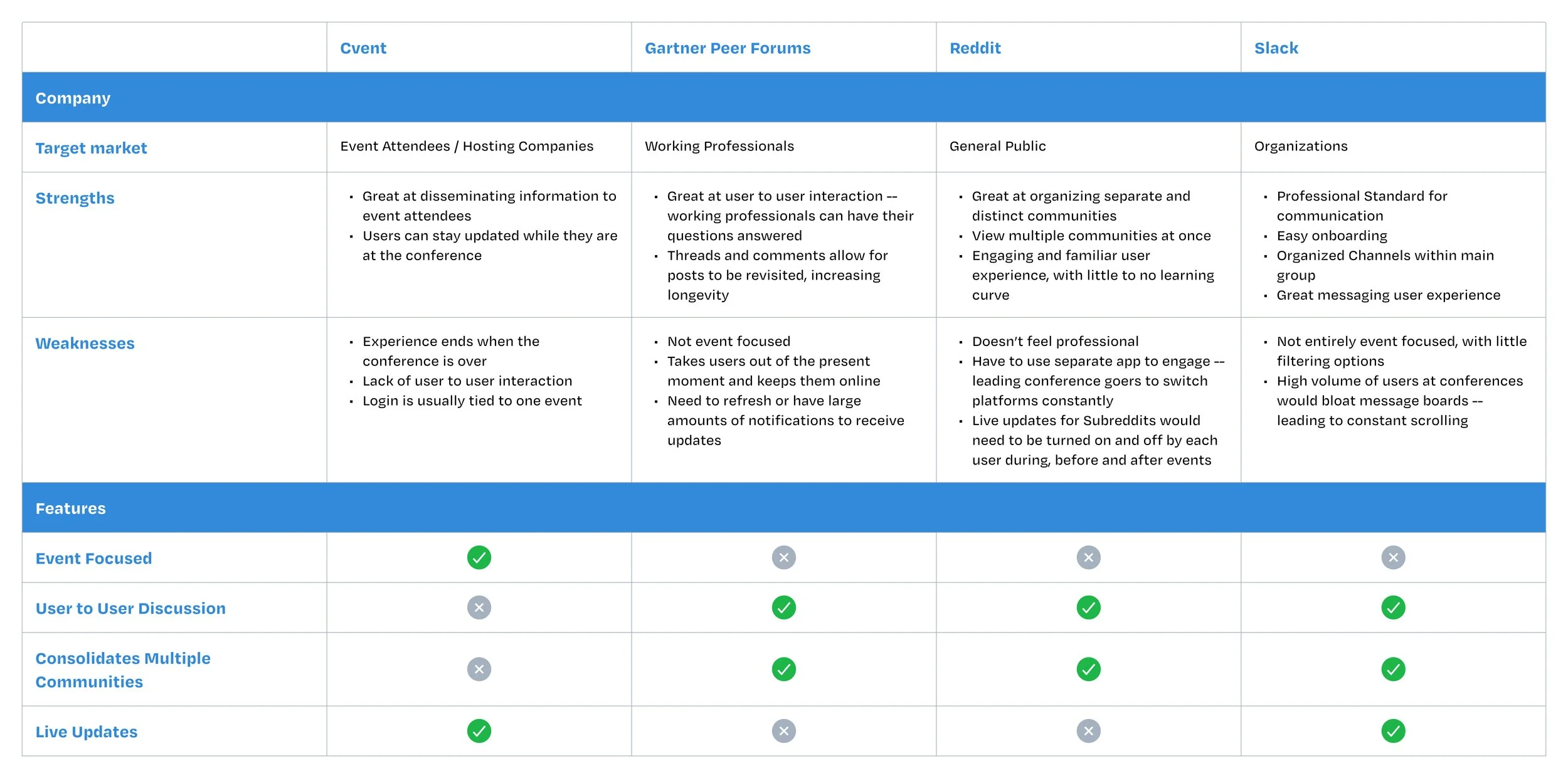
Since this was an early stage product, I decided to conduct a competitive analysis to understand the existing space and where we could find our niche.
Taking a look at existing use cases helped us define our goals
Through this analysis we discovered that we needed to combine several of the existing online flows into one that aligned closely our target audience’s needs.
Phase Two
Design Ideation

THE SITEMAP QUESTION
How do we eliminate siloed experiences while still creating the option to keep events separated?
We discussed various sitemap options to answer this question, going through multiple iterations trying to balance a “feed-style” layout with event pages.
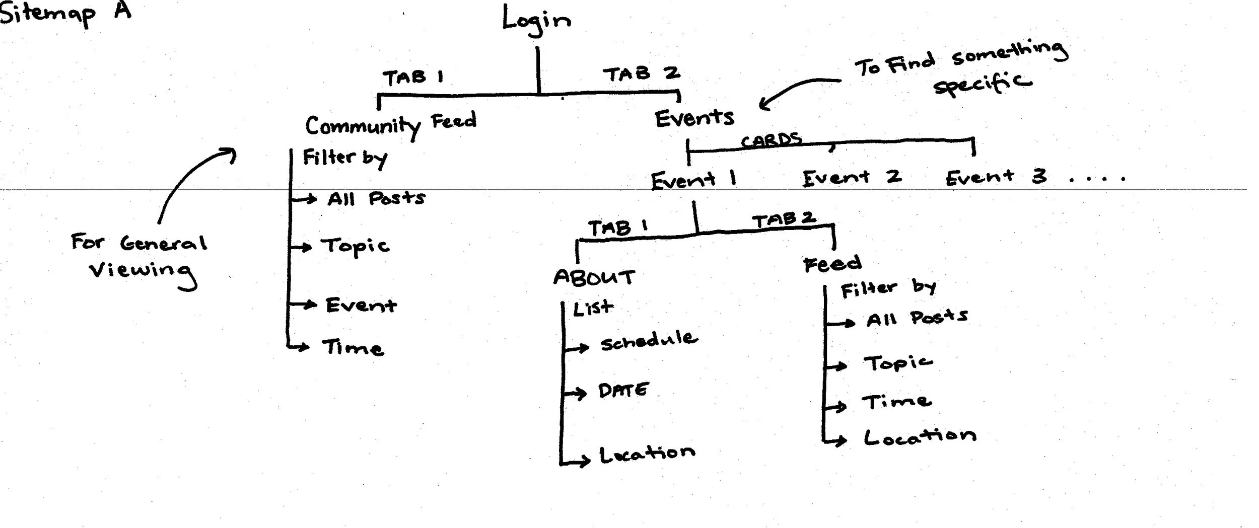
Sitemap Plan A
While Sitemap A didn’t end up as the final design, it helped our team begin to visualize the most essential components of each section.
Sitemap Plan B
While Sitemap B didn’t connect the community and events section in the most efficient way possible, it helped our team figure out the “3 Main Flow” layout used in the final design.

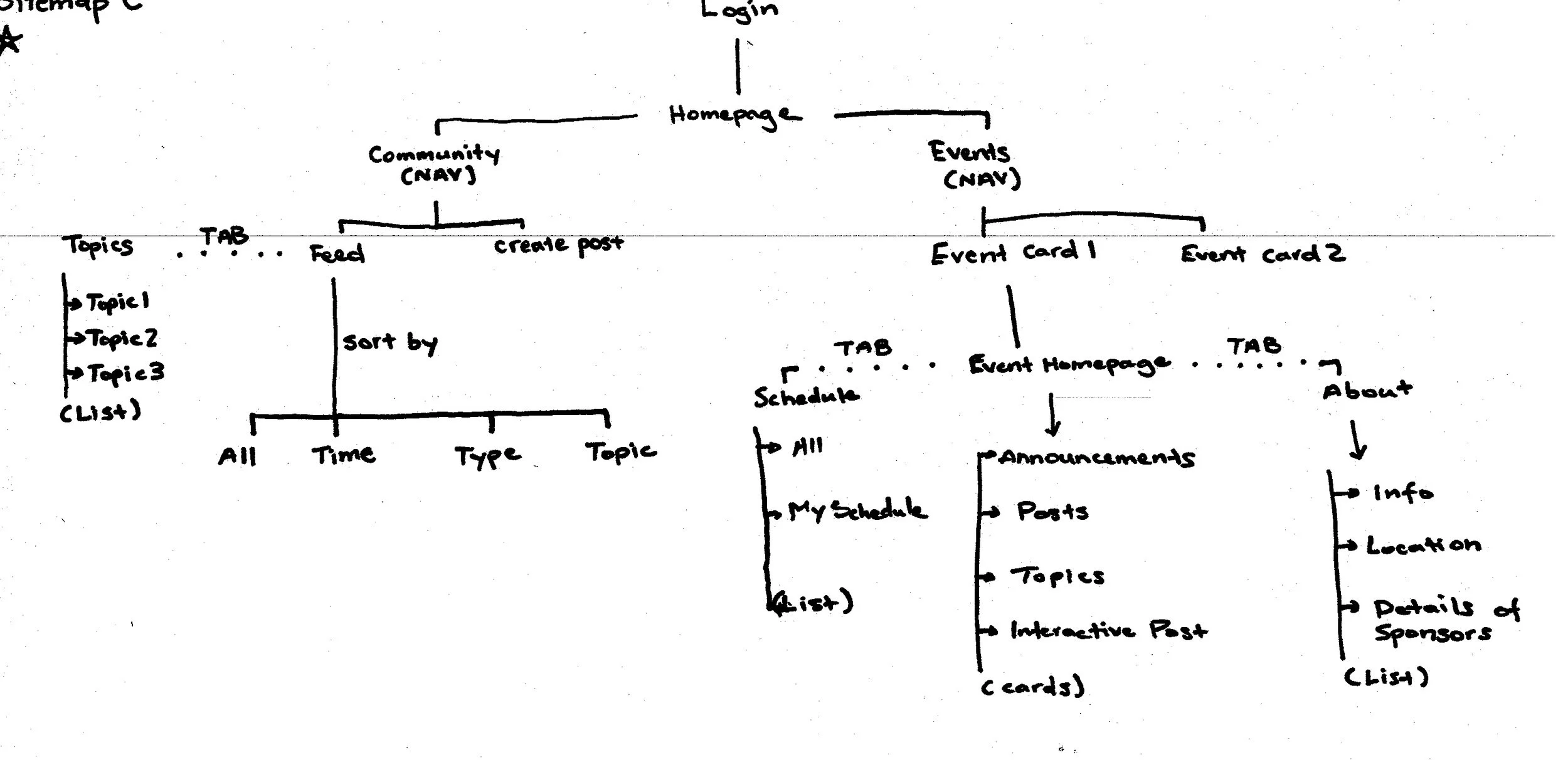
Sitemap Plan C
Sitemap Plan C combined the essential components of Sitemap A, while incorporating the “3 Main flow” layout used in Sitemap B. We used this sitemap as the foundation for the final sitemap design.
The Final Sitemap
The sitemap we landed on combined the essential components of Sitemap A, the “3 Main Flow” approach of Sitemap B, and the organizational structure of Sitemap C.

Phase Three
Design in Figma

WIREFRAMING IN FIGMA
Layout of the community section
I first focused on the main layout and organization of the community section. Since the app combined multiple events into one feed, I needed to find a way to keep everything organized. With the page divided into 3 sections, users could see all their posts, search by topic, and look at event groups.
Initial Wireframes for Community Feed, Topic Pages, and Event Groups

Visualizing ways for users to interact
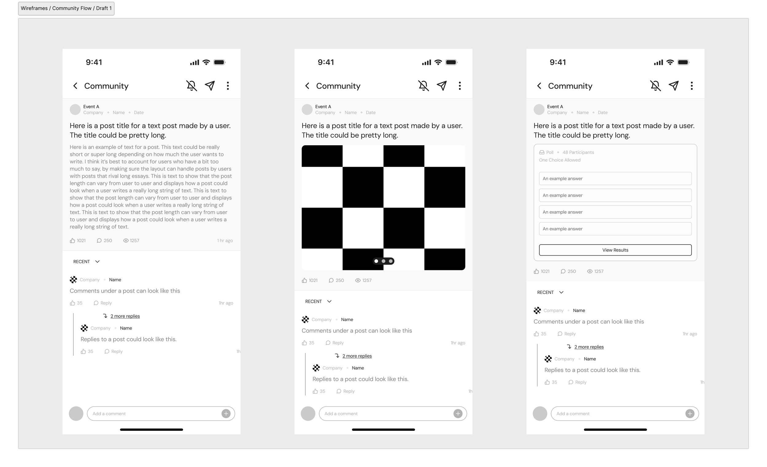
Since the existing system supported only text based posts, and single image posts, introducing carousels and polls added additional ways for users to interact and share more from their event.
Initial Wireframes for Post Types: Text Based, Image Carousel, and Polls
ITERATING ON THE DESIGN
Clearing clutter and iterating on existing designs.
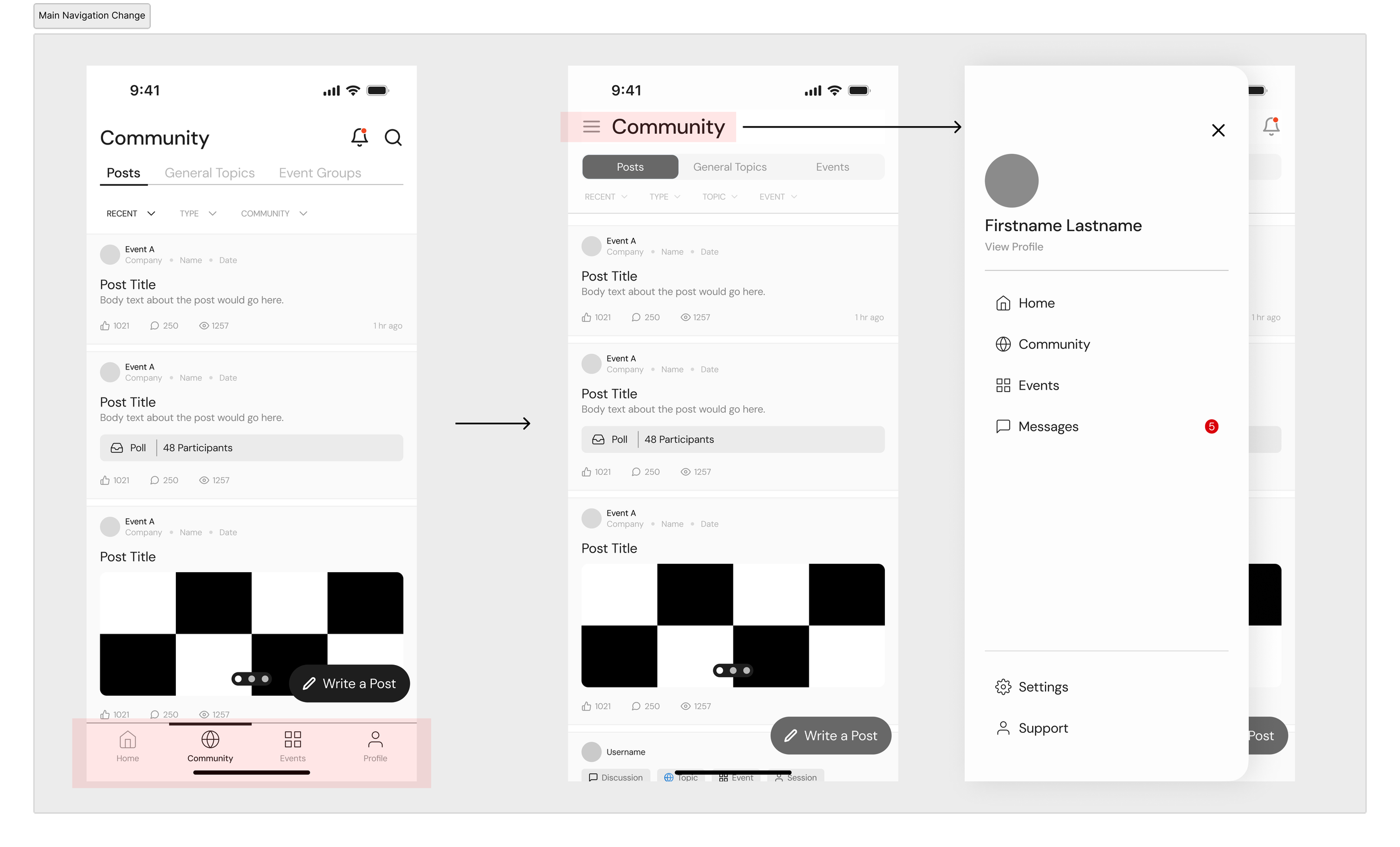
After creating the intial designs, we made improvements after a group review.
Adjusting navigation for mobile browser space
Since many mobile browsers like Chrome and Safari take up screen space from the default search and website link bars, we decided to use a hamburger menu to save space on the screen and have the content take up as much space as possible.
Helping users understand where they were with clearer tabs
The tab bars at the top seemed to float in space, leaving a disorganized appearace between page headers and the content below. We opted to go for a more defined tab to clearly show the user where they were on the community section.

Organizing post headers to adjust for tags
Since we were organizing posts by tags, having large strings of text could prove to be a legibility issue. Creating boxed tag elements not only allowed us to have scalable and reusable components for tags, but also fixed legibility issues.

HIGH FIDELITY DESIGNS
Creating High Fidelity Mockups
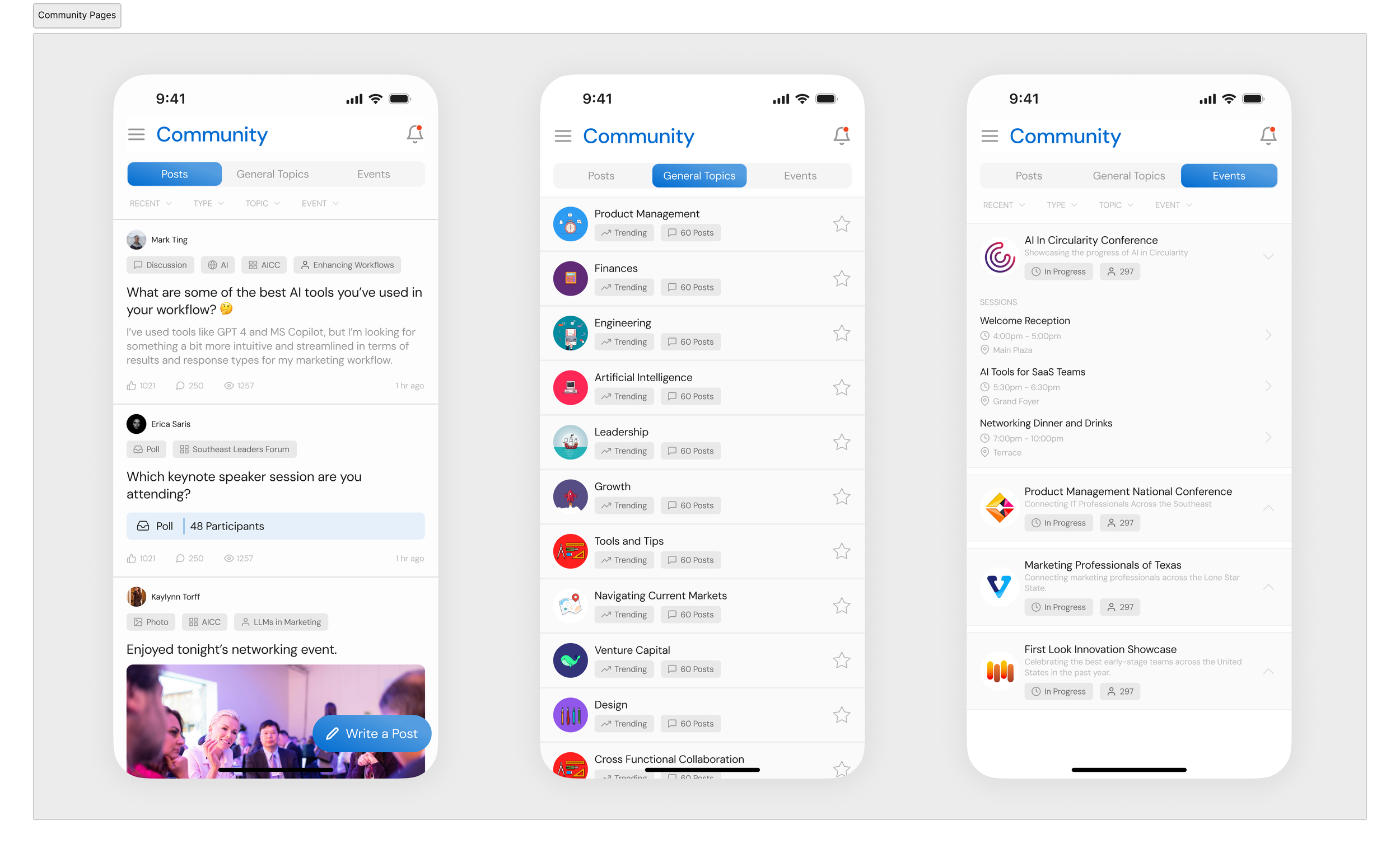
Once we were set on the layout from the wireframes, I created high-fidelity mockups of all screens we planned to build.
Community Section: Posts, General Topics, and Event Groups
Types of Posts: Text, Image Carousel and Polls
Event Group Pages: Event Information, Event Posts, and Event Schedule

Phase Four
Pitch Deck


